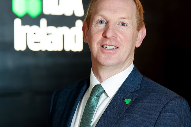
Michael Lohan has been appointed as CEO of IDA Ireland
A BRAND review of the state investment agency IDA Ireland found it was often “mis-quoted” and “confused” for other organisations including the Irish Dental Association, Enterprise Ireland or the Department of Enterprise. It also detailed how it was vulnerable to bizarre fluctuations in internet traffic around events like the catastrophic Hurricane Ida when visitors to their site leapt from 1,000 impressions to 15,000 in a single week. An internal presentation said IDA Ireland had suffered from “brand drift” where senior managers and marketing teams had become “fatigued” with the existing look and feel of the organisation. The paper was prepared ahead of a €428,000 rebranding intended to stand for a “contemporary Ireland” for the digital age. The presentation was critical of how their identity had evolved including a mission statement around winning foreign direct investment. “It’s honest, direct and explains exactly what IDA are doing. However, it falls a bit flat —how are we going to be number 1?” said one slide. The strategy document said brand guidelines were lacking in terms of direction and were not being adhered to in any case. It said the guidelines had missing sections around tone of voice, advice on use of photographs and “many areas need improvement.” “Effective brands are consistent and recognisable to the client [and] audience at every touchpoint. Materials should be cohesive,” said the paper. It said colours were being used in a “free for all” and that bright colours introduced after the recession “actually jar” with the older brand. The presentation raised concerns over confusion and misrepresentation where the IDA would get mistaken for other organisations. It said search engine optimisation was a particular problem and a simple search for ‘IDA’ online was not always successful. “When prospects (in the US, in this case) search Google for ‘IDA Ireland’ the click-through rate (CTR) is 42 percent,” said one slide. “That is indicative that a large number find what they’re looking for, which is our website. When they look up ‘IDA’ the click-through rate is only 4 percent.” It said much better results were found when people looked using searches like ‘Invest in Ireland’ or ‘IDA strategy’. The paper said there had been extensive “brand drift” with new things being added to their identity in a haphazard way. One slide said: “This often happens because senior managers and marketing teams become fatigued with brand assets or enticed by visual elements that other brands are adopting. “The more you drift from your brand style the more people’s awareness of your brand drifts. Adopting visual trends that conflict [with] your own aesthetic actually do more damage than good.” It concluded by saying the IDA had a “fragmented brand” and that a specialist agency be hired to develop a new identity. The €428,000 project resulted in a new logo which included a “trinity of dots” that is designed with a nod to Ireland’s iconic shamrock. The development agency said the vibrant green colour and the “bespoke typeface” were created to “exude confidence with a nod to Irish personality”. Asked about the discussions, a spokesman said the IDA continually monitored the effectiveness of their brand in driving awareness of Ireland as a place to invest. He said: “Our rebrand is a build on earlier successes, capturing our heritage while reflecting our current strategic focus of digitisation and sustainability. “It is an investment that will support our efforts for the coming decade in securing FDI [foreign direct investment] projects across the country.”

